Data Interpretation - Line Charts

Avatto > > ACET > > PRACTICE QUESTIONS > > Data Interpretation > > Line Charts

What is Line Graph or Line Chart ?

  • A Line Graph is a way of plotting data points on a line. It is generally used to show trends in data.
  • It helps managers to take faster decisions.
  • One can represent a large amount of data using a simple Line Chart.

What are Line Chart Examples ? 

In this section you will find sufficient number of Line Chart Examples to make concepts clear.

Instructions:
Directions. The graph given below represents the variations in earnings in rupees over a week. Study the graph and answer questions given below
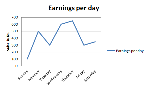
  The difference in earnings was large between

1. The difference in earnings was large between

Cancel reply

Your email address will not be published. Required fields are marked *


Cancel reply

Your email address will not be published. Required fields are marked *


Instructions:
Directions. The graph given below represents the variations in earnings in rupees over a week. Study the graph and answer questions given below

  The difference in earnings was large between

2. Highest earnings were on

Cancel reply

Your email address will not be published. Required fields are marked *


Cancel reply

Your email address will not be published. Required fields are marked *


Instructions:
Directions. The graph given below represents the variations in earnings in rupees over a week. Study the graph and answer questions given below

  The difference in earnings was large between

3. The average earnings per day during the week was

Cancel reply

Your email address will not be published. Required fields are marked *


Cancel reply

Your email address will not be published. Required fields are marked *


Instructions:
Directions. The graph given below represents the variations in earnings in rupees over a week. Study the graph and answer questions given below

  The difference in earnings was large between

4. The money transactions between Sunday-Monday and Tuesday-Wednesday were

Cancel reply

Your email address will not be published. Required fields are marked *


Cancel reply

Your email address will not be published. Required fields are marked *


Instructions:
Directions. The graph given below represents the variations in earnings in rupees over a week. Study the graph and answer questions given below

  The difference in earnings was large between

5. The earnings were least on

Cancel reply

Your email address will not be published. Required fields are marked *


Cancel reply

Your email address will not be published. Required fields are marked *