How are bar graphs used in real life…..
How are bar graphs used in real life…..
What is meant by a bar graph?
A bar graph is a chart which represents the differences among the collection or category of the data. It is the pictorial representation of data in the form of bars. These bars are be shown as horizontal or vertical.
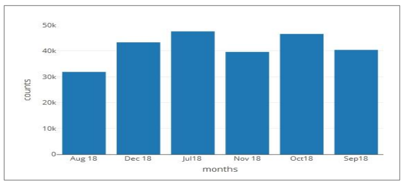
Bar graphs which is with vertical bars to be called as vertical bar graphs. A bar graph will have two axis. One axis will depict the types of categories which are getting compared and the other will have numerical values that shows the exact values of the data. We can use these axis in reverse also. But it will represent the same data. If the descriptions are shown on the horizontal axis, the bars will be vertically, and if the values are along the horizontal axis, the bars will be horizontally.
What are the different types of bar graphs?
Basically there four types of bar graphs:
- Vertical Bar Graph – data is represented vertically by using rectangular bars.
- Horizontal Bar Graph – data is represented horizontally by using rectangular bars.
- Stacked Bar Graph – also known as composite bar graph. In this graph, the bar is divided into many different parts and each part is differentiated using colors to identify the category of data.
- Grouped Bar Graph – as name suggests it is the group of data with different categories. This is also known as clustered bar graph. In this graph, few bars are grouped based on the category.
What is bar graph used for?
Bar graphs are used to represent the important data. One can write a big paragraph to make the information useful, but a single bar graph can be used to replace that big paragraph precisely and in readable format.
What is bar graph with example?
A bar graph is a pictorial representation of data in the form of bars. These bars can be shown either horizontal or vertical. See more Bar Graph questions here
For example: we can show the cricket data from last 10 years. Horizonal(x-axis) we can take different formats of cricket like ODI, Test- Matches, T-20 and in vertical (y-axis) bars we can show the number of matches we won or lost.
We can also show a cricket player’s career using bar graphs.
How do you explain a bar graph?
Bar graph is used to compare the data of different categories with respect to the time. Data and time are shown as horizontally (x-axis) and vertically (y-axis) respectively. For example, an athlete can make a bar graph of his each race. He can show in what time he completed the different format of race like 100 mt., 200 mt. etc.
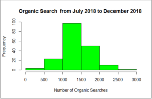
What is a histogram vs bar graph?
A bar graph is mostly used to compare different data among different categories with the help of horizontal or vertical bars. Where as the Histogram is used to show case the distribution of the data in certain range. Histogram looks like the bar graph but there is no gap between the bars in histogram but we have gap in bar graphs.
What is double bar graph?
A double bar graph show case the details using double bars, beside each other. The height of the bars can be different based on the data. Two kind of data can be compared using double bar graph.
For example we can compare the class results between two years by placing two bars aside to each other. This is called double bar graph.
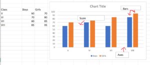
What are the parts of a bar graph?
A bar graph has label (Title), axes (x-axis and y-axis), scales which increment of the axis and bars.
- Title: explains the agenda of the graph.
- Axes: showcase the details of the data like what kind of data is being shown.
- Scale: show case the performance, it is the number that show the units used in graph.
- Bars: measure the data in numerical form.
What do graphs represent?
A bar graph is a collection of data which show cases using bars. It helps to compare the data in most organized manner. The points shown in the graphs also represent the relationship between them.
How are graphs used in everyday life?
In routine life we can compare different type of data. We can use single line chart, pie chart etc. to get the information of performances. For example one can compare the productivity of him/herself on daily/ weekly or monthly basis. Which represent the exact results and helps to get better than last bar.
How do you use graphs?
We have different kind of graphs like- bar graphs, pie- chart, line graphs etc. Based on the data we can decide which type of graph is to be used. For example a line graph is used to showcase the increment or decrement of numbers over a certain time.
What do graphs help see?
Graphs are the way to see the relationship between certain type of data. The intention of using a graph is to show the data in certain way which is easy to understand and easy to remember. Graphs also helps to make the performance better by comparing the data of two things.
What is the difference between graphs and charts?
Chart is a bigger term than the graphs. A Chart showcase the data in various forms like graphs, diagrams, tables etc. and it uses various methods to represent the large scale of data. Where as graph is just a type of chart which represent the mathematical relationship among different set of data along two dimensions plotting on horizontal (x-axis) and vertical (y-axis) . All graphs are charts but not all charts are graphs.
What are the advantages of bar graphs?
There are many advantages of bar graphs:
- It reduces the efforts by showing the data in visual form.
- Big paragraphs can be easily replaced by graphs in terms of showing relationship between a set of data.
- Graphs can show a lot of information using bars which is really easy to understand