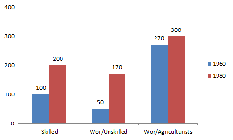
Data Interpretation - Bar Graph

    In the above graph which category shows approximately 10% increase in the periods shown?

61. In the above graph which category shows approximately 10% increase in the periods shown?

Cancel reply

Your email address will not be published. Required fields are marked *


Cancel reply

Your email address will not be published. Required fields are marked *


62. Click on next page for next question

Cancel reply

Your email address will not be published. Required fields are marked *


Cancel reply

Your email address will not be published. Required fields are marked *


63. Click on next page for next question

Cancel reply

Your email address will not be published. Required fields are marked *


Cancel reply

Your email address will not be published. Required fields are marked *


64. Click on next page for next question

Cancel reply

Your email address will not be published. Required fields are marked *


Cancel reply

Your email address will not be published. Required fields are marked *


65. Click on next page for next question

Cancel reply

Your email address will not be published. Required fields are marked *


Cancel reply

Your email address will not be published. Required fields are marked *